- Steven Wetrich

- Feb 12, 2018
- 2 min read

With better camera sensors and more accessible color correction and grading tools, there is more pressure than ever for video producers to capture and use color effectively. Color is an incredibly effective communication tool not to be overlooked, and constructing a coherent color palette begins in pre-production.
It’s no longer enough to simply release an edited video without some form of color treatment. For many, this may mean just slapping a LUT over their footage and calling it a day. At the very least, it’s important to make sure you color correct first, to ensure your footage is coherent within that look. But color is even more powerful when you take it a step further, and approach color as a part of the storytelling. It isn’t when it just looks cool, but helps serve what your film is saying.
Color Theory
If you do some research, it’s pretty surprising how much you probably already know about color theory. Blue is a safe color, red can represent passion, love, hate, etc. But it’s important to remember that not everyone is going to interpret the same colors with the same meaning.
Some people take most of color theory literally, but an often overlooked way to look at color is that it is more of a Leitmotif, which, once again begins on set.
Some people take most of color theory literally, but an often overlooked way to look at color is that it is more of a Leitmotif, which, once again begins on set. Any Pixar movie does a fantastic job of assigning colors to feelings, people and moods, sometimes discarding broader cultural associations. Likewise, Game of Thrones has very different looks for each of the main locations.
The look begins on set.
When it comes to color, one of the most effective things you can do is to have a plan. Starting in pre-production, much of your look will be determined by locations, production design, costuming and lighting. In the digital age, we have so much control over color in post that it can be overwhelming, knowing where to start if you aren’t approaching it with a plan. This doesn’t mean that you won’t want to try things that might be a little riskier when deciding your look, but having references and ideas is crucial.
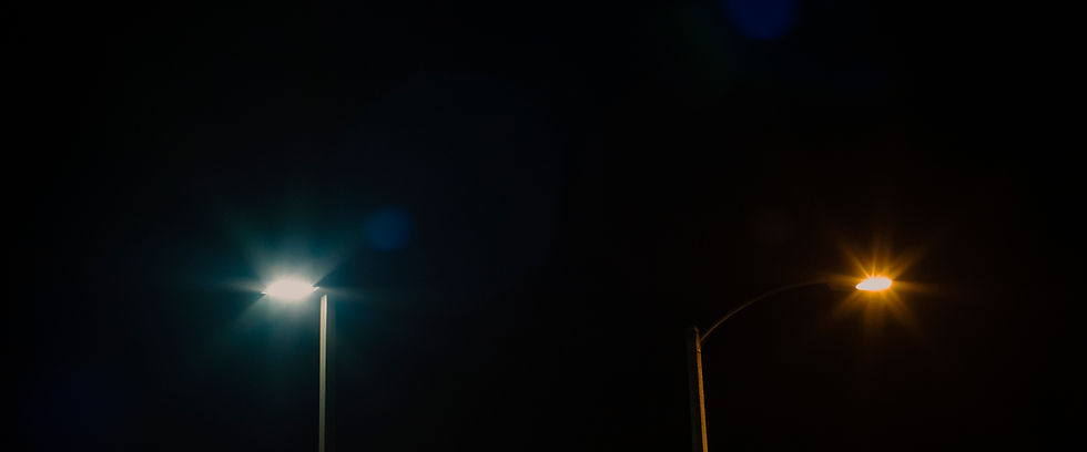
Lighting is a powerful tool when it comes to achieving your desired color effects. Daylight (5500k) and tungsten (3200k) are the two main color temperatures you’ll be working with in normal conditions, and there’s a plethora of combinations you can get with color correction gels and dimming. You can use color separation to help make a scene more dynamic. Emphasizing the warmth of skin tones against a cooler backdrop, for instance, can be a great way to bring focus to your subjects, while emphasizing the divide between character and environment. You can achieve this by practically by lighting your foreground and background with different color temperatures, then white balancing your camera for one or the other.
The rest of this article is available on Videomaker magazine's website.
https://www.videomaker.com/article/c10/19127-how-to-use-cohesive-color-palettes-to-tell-stronger-stories


